The King of Fools

Project type: Branding
Timeframe: January 2024 - June 2024
Tools: InDesign, Illustrator, Photoshop, Premiere Pro, After Effects
Problem
The primary goal of this branding project was to target a specific audience and establish a compelling brand from scratch. The challenge was to identify and engage an under-served niche market, creating a distinct brand identity that resonated with this audience. This involved comprehensive market research, strategic positioning, and developing a cohesive brand strategy to differentiate The King of Fools in a competitive landscape.
Solution
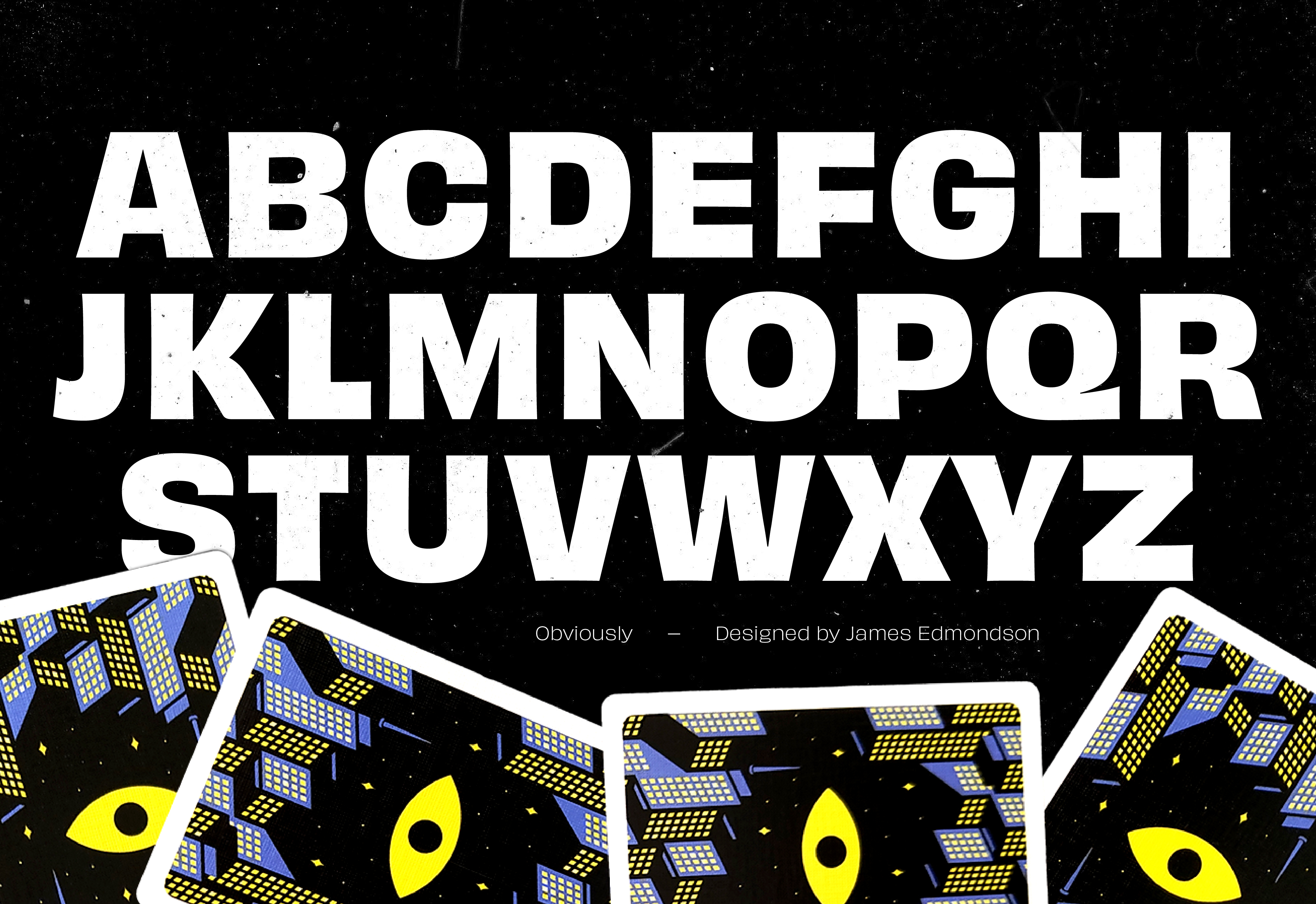
To address this challenge, we created a brand that resonated with individuals who actively use and abuse playing cards, with a strong emphasis on left-handed magicians. Unlike other companies that create polished studio images, The King of Fools embraced a raw, street-level approach, capturing the authenticity and grit of real-world card play. This strategy not only set the brand apart but also built a strong connection with its target audience.

Research

Some Context

Current competitors in the playing card industry often showcase their products with clean backgrounds, pristine decks, and extensive use of bokeh, presenting "just opened" cards in immaculate condition. While visually appealing, this approach overlooks the reality faced by street magicians, whose cards inevitably become bent, folded, torn, and dropped in challenging urban environments. It's almost as if these brands are afraid to acknowledge the eventual wear and tear their products will endure.

What Do We Do Differently?

For the King of Fools we chose to embrace this reality. The King of Fools already strove to create cards that not only last but feel amazing in the hand, even when they're rough and overly broken-in. By acknowledging and celebrating the authentic, rugged life of a deck of cards, we cut through the clutter and stand out in a market where everything else looks the same.

Competitors

What Are Smaller Groups Doing?

A quick look into what some smaller card creators are doing, such as Heath, Four Corner, and Gemini, reveals different approaches to presenting their products. Gemini, like many smaller card companies, relies heavily on 3D renderings of their work. However, we've observed that these renderings tend to perform poorly on social media, Kickstarter projects and sales.

On the other hand, groups like Heath and Four Corner adopt a closer-to-urban style in their photography. While their imagery is still very clean, the cards always appear "out-of-box" new. This approach, though visually appealing, doesn't fully capture the gritty, well-worn feel that resonates with our target audience. This insight further reinforces our commitment to showcasing the real-world, rugged use of our playing cards in authentic urban environments.

Larger Companies

Examining larger companies like Noc and Orbit provides additional perspective. Noc exemplifies the typical big-company style: clean, studio shots with pristine, untouched cards. This polished approach is standard among major players in the industry.

Orbit, however, offers a different narrative. Originating from urban street magic, Orbit has transitioned to clean cardistry while maintaining a simple card back style. Their roots in street magic align with a more authentic, real-world appeal, though their current presentation leans towards the cleaner end of the spectrum.

These insights highlight a gap in the market for a brand that fully embraces the gritty, well-worn aesthetic without compromising on quality—an approach that The King of Fools is uniquely positioned to fill.

The Twist

What does this Company inherently bring that’s different from everyone else? The King of Fools was born from the frustrations of left-handed card users who were tired of being forced to use cards designed for right-handed players. Traditionally, most playing cards are tailored for right-handed use, leaving left-handed users to awkwardly mirror tricks and flourishes, often struggling with their non-dominant hand.

In response, The King of Fools sought to create a deck that both left-handed and right-handed users could effortlessly use. This innovation ensures that card faces remain uncluttered, providing an inclusive and user-friendly experience for all card enthusiasts.

Key Words

We began by identifying key words to encapsulate the overall tone of the brand. Our initial selections included: Mysterious, Grungy, Impossible, Sly, and Deceptive. However, we intentionally avoided words like "tricky" or "magical."

To refine our tone, we curated a large collection of images to test against these descriptors. This exercise revealed the need for further refinement. Ultimately, we settled on a more assertive set of descriptors: Rebellious, Deceptive, Dangerous, Gritty, and Unapologetic. These words better captured the brand's essence and provided a cohesive direction.

Next, we organized a visual sorting exercise. We placed each image on a spectrum from "Off Brand" to "On Brand," annotating each with sticky notes explaining its alignment and suggesting improvements. This process deepened our understanding of The King of Fools' visual and emotional identity, ensuring consistency across all brand elements.

The Brand Archetype

The King of Fools aligns closely with the "Outlaw/Rebel" archetype, characterized by its disruptive, rebellious, and combative nature. Determined to leave a lasting mark, the King of Fools stands in stark opposition to the Status Quo and the current competition.

To resonate with this archetype, it’s crucial to express a clear disdain for conventional norms. Demonstrating a commitment to challenging and overturning the Status Quo will foster a strong connection. Encouraging, facilitating, or empowering acts of revolution will instantly make you a trusted ally within this rebellious community. Communication should be anything but formal; instead, adopt a tone laced with grit and attitude to truly capture the essence of the King of Fools.

The Logo

Sketches

When developing logo ideas, we aimed to find a symbol that was classic yet had a unique twist—something simple yet memorable.

Our goal was to subtly incorporate our two characters, the King and the Fool, without being overly obvious, while avoiding jester symbols which felt too playful. We also wanted to emphasize hands, reflecting the tactile nature of playing cards and our focus on left-handed designs.

After exploring various sketches, we decided to merge two concepts which had frequently shown up: eyes and a crown. By placing an eye on the left side of a crown, we created a visually striking and slightly imbalanced symbol. This combination of two simple icons resulted in a logo that is both distinctive and evocative of the brand's identity.

Digital Translation

When transitioning sketches to a digital format, it quickly became evident that clean lines didn’t align with the brand, and attempts to digitally roughen the design fell flat. While figuring out how to translate the sketch, the eye was adjusted to look slightly up and to the side, connecting the pupil with the body of the crown. This adjustment helped remove the robotic feel of a computerized logo and reduced some tight spaces within the design.

“Ah-ha” Paper Logo

This led to the idea of physically cutting the logo out of paper. Using simple printer paper and whatever scissors were on hand, sketches were made in both large and small sizes. The large cutout allowed for better detail, while the small cutout naturally introduced imperfections.

After photographing the cutouts and importing them into Illustrator, it was observed that the cuts lacked smooth curves, with some pieces torn and one corner of the crown accidentally clipped. With a bit of optical tweaking, these imperfections came together to create the final logo mark, perfectly embodying the rough, authentic feel aimed for.

The concept of a “paper crown” perfectly encapsulates the company’s name and characters, tying together the King and the Fool in a simple, memorable symbol.

Logo Text

When creating the wordmark to support the main symbol, a hands-on approach was taken. Using paper, the wordmark was crafted in a way that allowed the letters to come together like puzzle pieces. This method ensured that the wordmark complemented the main symbol, maintaining the brand’s cohesive, handcrafted, and unique aesthetic.

Now, as the King of Fools operates within a world dominated by mobile phones, mobility, and vertical formats, the King of Fools will primarily be viewed on these devices and on playing card boxes—the brand’s two primary points of contact.

Therefore, the main wordmark is designed in a vertical lockup to ensure optimal visibility on mobile screens.

However, recognizing the need for versatility, a horizontal lockup of the wordmark was also created. This ensures that the mark can adapt to various contexts, including the limited space available on the bottom of a deck of cards. By providing both vertical and horizontal lockups, it ensures that the King of Fools wordmark remains legible and impactful across different platforms and applications.

Color

Color selection presented a challenge as the aim was for a palette with impact without veering into the realm of “tacky magic shop.” Early on, the concept of Pyrite, or fool’s gold, was rolled around, intrigued by its symbolism. However, it didn’t quite align with the vision.

After experimenting with over 20 palettes, a vibrant acidic green, aptly named “Arrival,” was stumbled upon. This hue, when paired with black and white, perfectly embodied the aggressive and rebellious tone sought to convey.

Typography

Custom Type

Influenced by iconic horror literature of the late 70s and 80s such as “Wild Violets,” “The October Country,” and “Firestarter,” our custom typeface, aptly named “The King’s Type,” embodies a captivating narrative. It captures the initial regal essence of a serif font, while also having the dangerous darker side of horror.

The King

The main typeface was intended to embody the feeling of the horror genre while also having the stability and history of serif typefaces.

“The King” is exaggerated a little, gradually corrupting into a sharp, dark, and twisted iteration of itself, mirroring the gradual transformation of a crown slipping into the hands of a fool.

Emphasis Typeface

Of course, a typeface was needed for emphasis, and what better choice than something heavily inspired by Saul Bass and the tactile nature of his poster and type design. The King of Fools lives off the feeling of playing cards in the hand, so paper-like typography came naturally.

The Fool

We wanted our emphasis type to feel like we’ve been chopping up cards to make a statement. It should feel rough around the edges, a little unrefined, as if a fool made them. This typeface is used for emphasis or short words, almost like an interjection, with the fool’s true nature showing and shouting out.

The Body Type

Selecting a third typeface to complement the design posed a challenge. A font was sought that remained highly legible at small sizes yet retained distinct character without straying too far from convention.

Enter Obviously. Its bold, clean lines and high contrast offer a sharp difference to The King and The Fool. Clean and snappy, just like a new deck, while still packing a punch when called upon.

Photography

The Look & Feel

Photography was a collaborative effort with Katie Camm, who played a crucial role in capturing the perfect shots under the art direction. Their expertise and assistance were invaluable for this portion of the project!

For the photography, hitting the streets was imperative. It was clear that a studio setting wouldn’t capture the raw authenticity that The King of Fools embodies. To stand out, an unconventional approach was taken, seeking out the grittiest corners of the city. The aim was to showcase dirty backgrounds and well-worn decks, emphasizing rough edges and signs of heavy use. Of course, this commitment sometimes meant venturing out into the pouring rain or working late into the night to capture the perfect atmosphere.

Throughout the entire branding process, immersion in the world of cards was key. Games were played, tricks were performed, and yes, even mistakes were made, resulting in dropped decks during shoots. Rather than shying away from these mishaps, they were embraced. Cards were never replaced to maintain a pristine appearance; instead, a bit of water saturation and city grime were welcomed, adding essential authenticity to every image.

Final Thoughts

Overall, this project involved many moving parts. The key to navigating these complexities was the visual sorting scale. This tool helped clearly define and refine the brand’s direction and visual identity, resulting in confidence in the brand’s future look and feel.

What’s next? The process of developing the marketing campaign to launch the playing cards is ongoing, along with continued testing of prints to ensure the colors and card feel are perfect; with plenty of tasks remaining on the horizon.


This project underscored the value of collaboration. When working freelance gigs and partnering with other designers, the speed and efficiency of idea generation are significantly enhanced. Working solo, multiple walks through the city were needed to gain fresh perspectives and break out of the bubble. It became evident that creating in isolation has its drawbacks—things made in a vacuum… suck.